When it comes to home design, one of the most influential trends each year is Pantone’s Color of the Year. This color not only captures the essence of the moment but also shapes how people approach decorating and styling their living spaces. Whether you’re a DIY enthusiast or a professional designer, Pantone’s color can offer fresh ways to add personality and vibrancy to your home.
Understanding Pantone’s Color of the Year
What is Pantone’s Color of the Year?
Pantone’s Color of the Year is a carefully selected hue that symbolizes the mood, cultural influences, and global trends for the upcoming year. The company’s experts, known for their deep understanding of color psychology, announce the chosen color every December. It’s not just a trend—it’s a cultural moment.
How Pantone Chooses the Color of the Year
Pantone doesn’t pick a color at random. They base their decision on years of research, global events, and socio-political influences. They analyze everything from the fashion industry to global events and emerging technologies, ensuring that the color chosen reflects the collective feeling of the year ahead.
Why Pantone’s Color of the Year is a Design Trend
The Cultural Influence Behind Color Trends
Pantone’s Color of the Year reflects more than just aesthetic preferences; it’s a mirror to societal changes. Colors can represent optimism, tranquility, or even uncertainty. The Color of the Year captures the mood of the world, influencing various industries, from fashion to design to marketing. In essence, it’s a visual representation of the time we live in.
Pantone’s Impact on Interior Design
Pantone’s annual color selection carries immense weight in the world of interior design. Designers, homeowners, and even furniture manufacturers take cues from the Color of the Year to refresh their collections. This influence often sets the stage for the upcoming design season, helping homeowners stay relevant with the most up-to-date looks.
How to Incorporate Pantone’s Color of the Year into Your Home
Now that we understand why Pantone’s Color of the Year matters, let’s dive into how you can incorporate it into your home. Whether you’re redecorating a single room or overhauling your entire space, these tips will help you introduce the color in ways that feel fresh, stylish, and cohesive.
Small Accents for Big Impact
If you’re not ready to completely overhaul a room, start small. Incorporating the Pantone color through accessories such as throw pillows, curtains, rugs, and vases can add a pop of color without overwhelming the space. These accents are an easy and cost-effective way to update your home.
Color Blocking in Interior Design
Color blocking is a popular design technique that uses large blocks of solid color to create bold contrasts. Pantone’s Color of the Year is a great choice for color blocking, whether on walls, furniture, or accent pieces. Try pairing the color with neutral tones like beige or grey for a modern, minimalistic look.
Choosing the Right Furniture and Fabrics
Pantone’s Color of the Year can be incorporated into your furniture and fabrics. From sofas to chairs to bed linens, choose pieces that feature the color in subtle or statement-making ways. Velvet cushions or fabric-covered ottomans are great options for introducing color into your living room or bedroom.
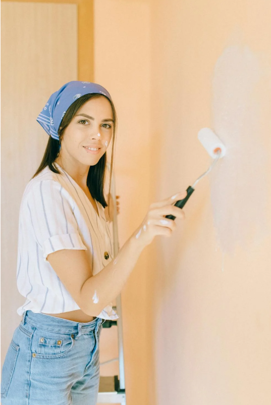
Incorporating Pantone’s Color in Wall Colors
If you’re feeling bold, consider painting an accent wall or even all of the walls in Pantone’s Color of the Year. Accent walls work well in smaller rooms or to create focal points in larger spaces. This is a fantastic way to give a room an instant refresh.
Using Pantone’s Color for Statement Pieces
Statement furniture pieces, like a bold-colored armchair or a unique coffee table, are perfect for showcasing Pantone’s Color of the Year. These standout items can elevate your décor and give the space an entirely new vibe without requiring a major overhaul.
Pantone’s Color of the Year in Different Rooms
Living Room: Bold Yet Cozy
In the living room, Pantone’s Color of the Year can create an inviting and stylish atmosphere. Use it in combination with comfortable, plush materials to achieve a balance between modern boldness and homey warmth.
Kitchen: Refreshing and Energizing
If you want your kitchen to feel vibrant and energized, consider incorporating Pantone’s Color of the Year into your backsplash, cabinetry, or even small appliances. A burst of color in the kitchen can make meal prep feel more fun and exciting.
Bedroom: Calm and Serene
Pantone’s Color of the Year can help create a soothing, peaceful environment in the bedroom. Whether through bedding, wall art, or accent walls, this color can enhance relaxation and promote a restful night’s sleep.
Office: Focused and Motivating
A home office is a space where productivity thrives. Pantone’s Color of the Year can help create a space that is both motivating and inspiring. Try incorporating the color into your desk, chair, or even office supplies for a little extra encouragement.
Color Combinations and Pairing Pantone’s Color of the Year
Complementary Color Schemes
When using Pantone’s Color of the Year, consider pairing it with complementary colors for a balanced, harmonious design. Look for colors that are opposite on the color wheel for a dynamic contrast that still feels cohesive.
Combining Warm and Cool Tones
Pantone’s Color of the Year often pairs well with both warm and cool tones, creating an interesting contrast. Combining the color with neutral shades, earthy tones, or even metallic accents can elevate your space without overpowering it.
Monochromatic and Gradient Designs
For a more subtle approach, opt for a monochromatic or gradient design. Using various shades of the same color can create a smooth, sophisticated look that doesn’t rely on stark contrasts.
DIY Ideas for Adding Pantone’s Color of the Year
Customizing Your Accessories
If you’re on a budget, DIY projects can be a great way to incorporate Pantone’s Color of the Year into your home. Try painting picture frames, flower pots, or even lamp shades in the color to add personalized touches to your décor.
Revamping Old Furniture
Old furniture can get a new life with a fresh coat of paint or new fabric in Pantone’s Color of the Year. Revamping items like chairs or coffee tables can add character to your home and make old pieces feel brand new.
Trends to Look for in the Future: Pantone’s Influence on Design
Pantone’s Color of the Year continues to shape the way we approach home décor, and its influence is likely to expand in the coming years. As the world evolves, so do design trends, and Pantone plays a pivotal role in shaping them.
How Pantone Shapes Future Trends
Pantone’s Color of the Year isn’t just about immediate trends—it has a lasting impact on future design. It often sets the stage for a cascade of trends, from fashion to architecture, influencing not just homes but public spaces, retail designs, and more.
Conclusion
Incorporating Pantone’s Color of the Year into your home is an excellent way to stay current with the latest design trends while adding a personalized touch to your space. Whether you opt for small accents or a full room overhaul, this color can make a big impact in creating an environment that feels fresh and on-trend. So, what are you waiting for? Let your
No responses yet